User Interface
The goal of the user interface (UI) is to visualize the output data and the fitted response model. A variety of options are provided for the user, ranging from the selection and restriction of the displayed data over color-scales and error-bars to specifications for the fit parameters.
Starting of the UI
The UI is started via the terminal with the following command:
profit ui
Then the dash app will be started and can be viewed in the web-browser of your choice at http://127.0.0.1:8050/.
General structure
To visualise the data and to grant a straightforward user experience, the layout is divided into the following three sections:
axis / fit options
graph
filter options
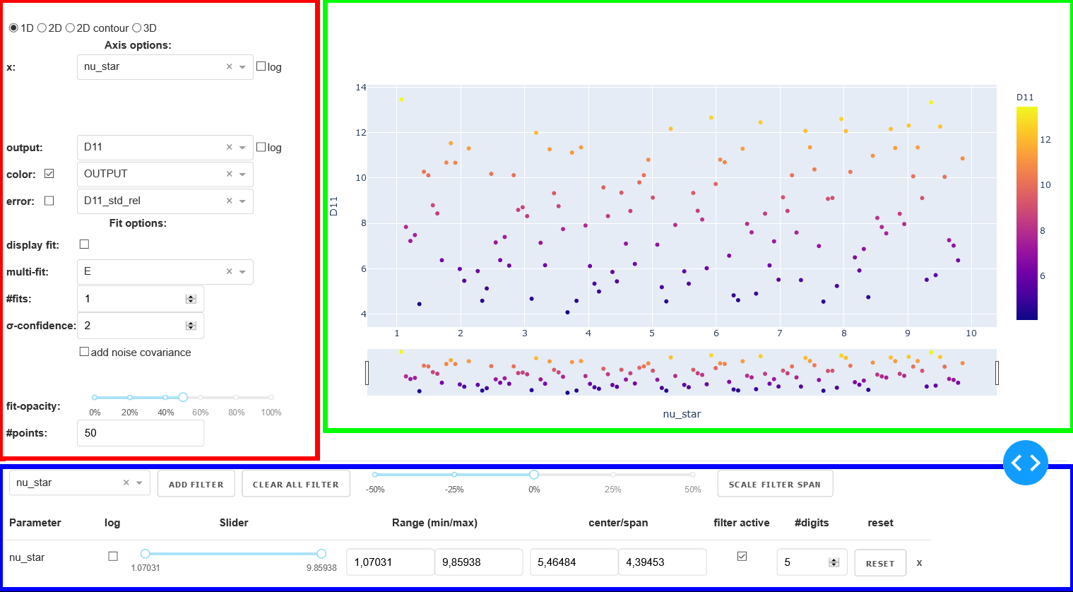
Layout of the user interface with the three major sections: axis/fit options (red), graph (green) and filter options (blue).
Axis/Fit options
In this section of the layout the following three different types of options can be controlled:
graph-type
options for the axis (including color and error)
options for the fit based on the response model
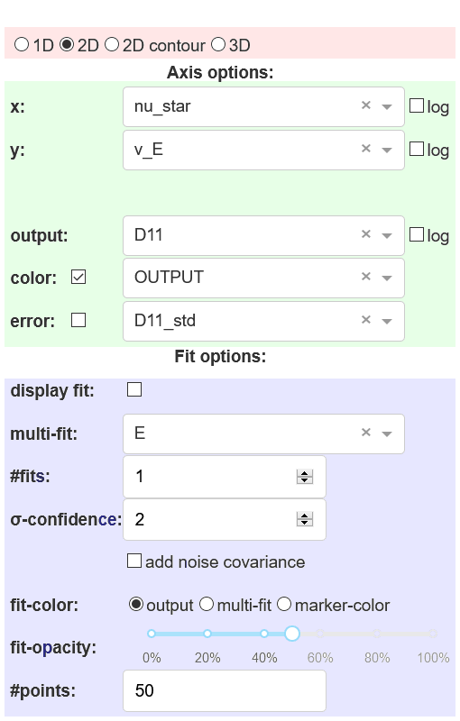
Different types of options in the axis/fit options section of the UI: graph-type (red), axis options (green) and fit options (blue).
Graph-type
There are four different graph-types available:
- 1D (scatter & line)
- input: xoutput: y
- 2D (scatter & surface)
- input: x | youtput: z
- 2D contour
- input: x | youtput: color
- 3D (scatter & isosurface)
- input: x | y | zoutput: color
The four graph-types are shown below with sample data and a sample response model:
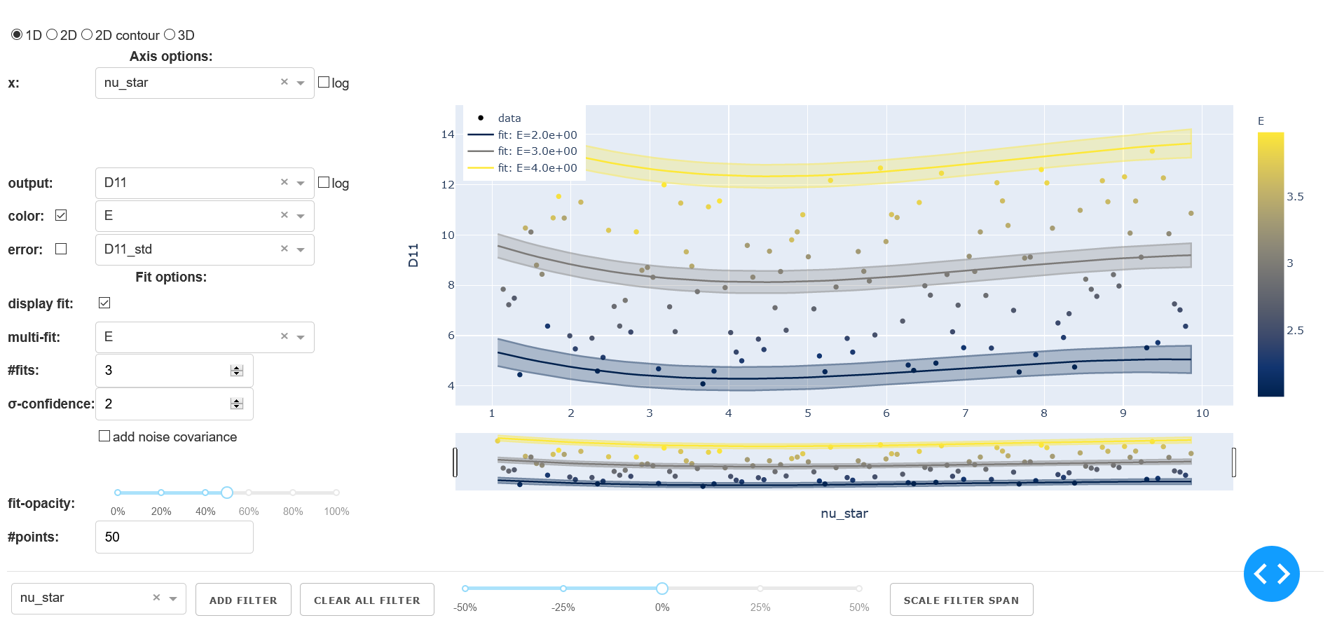
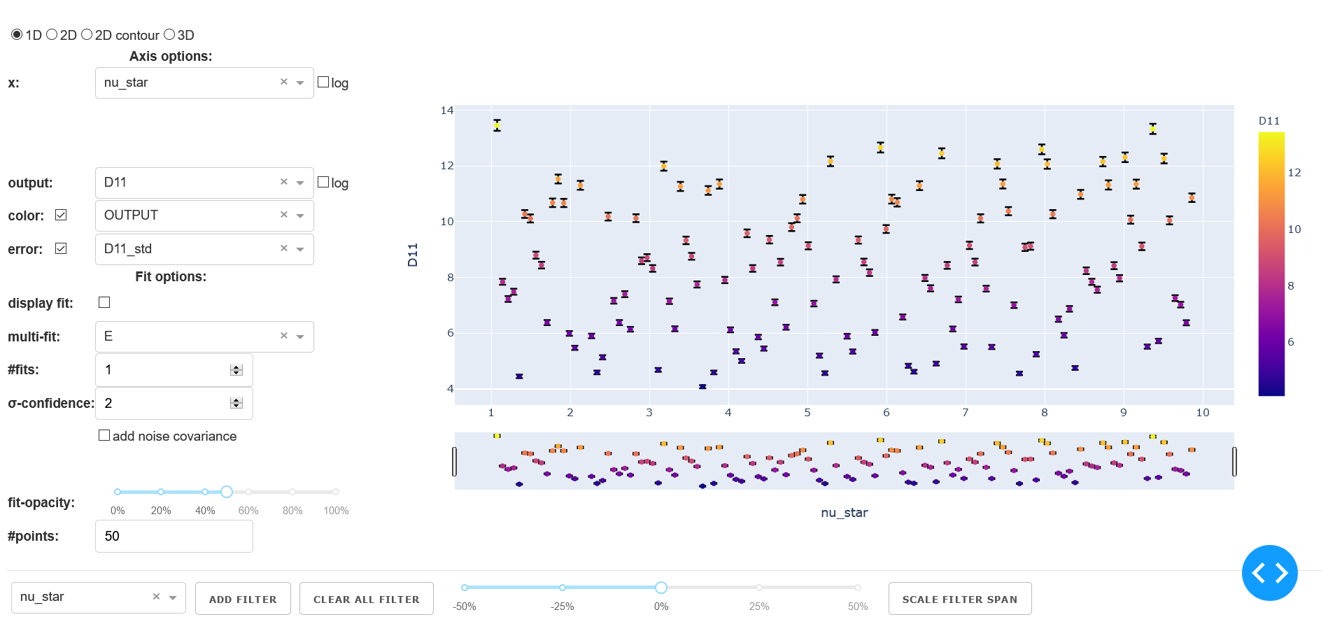
Example of the UI for a 1D graph.
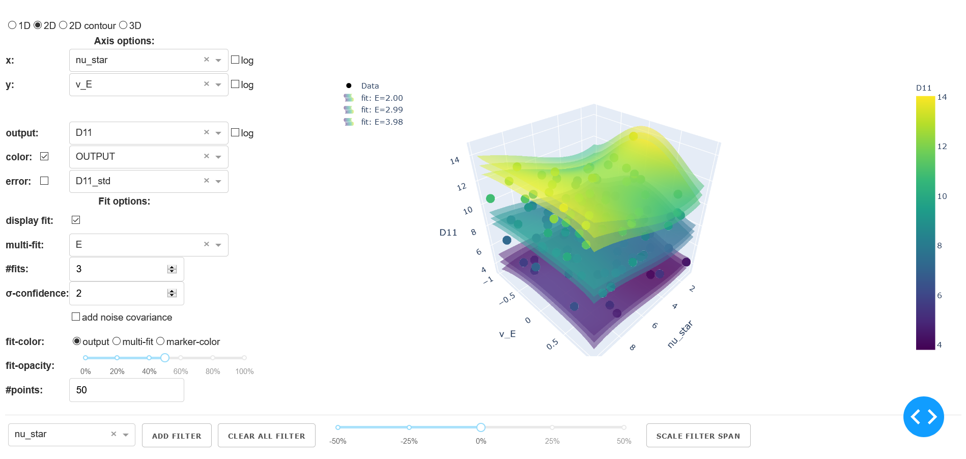
Example of the UI for a 2D graph.
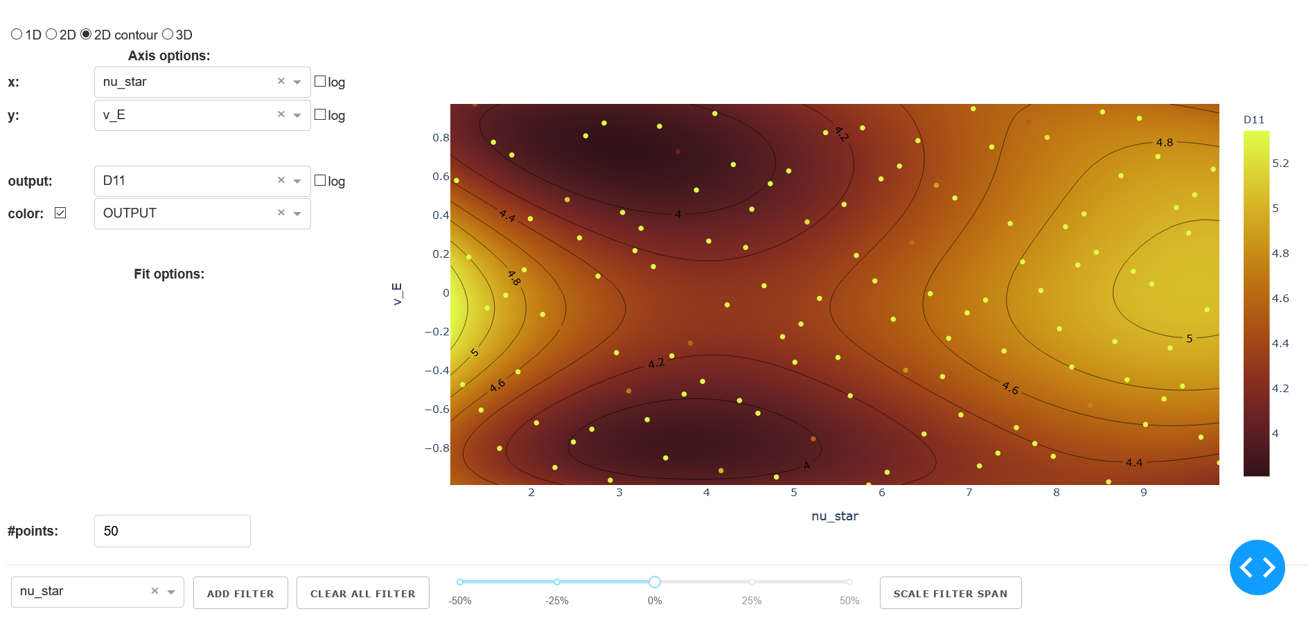
Example of the UI for a 2D contour graph.
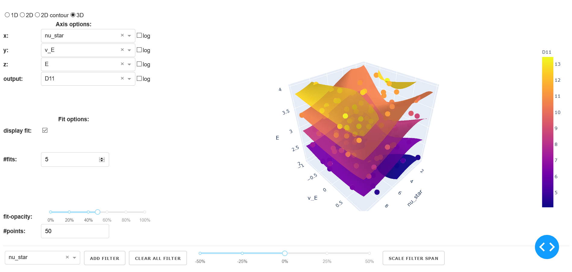
Example of the UI for a 3D graph with isosurfaces.
Axis options
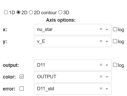
Example of the axis options for a 2D graph-type.
The section axis options contains all the control options concerning the selection and the display of the data. Depending on the graph-type different options are available.
- x | y | z
- number of rows depending on graph-type
- Type:
dropdown
- Options:
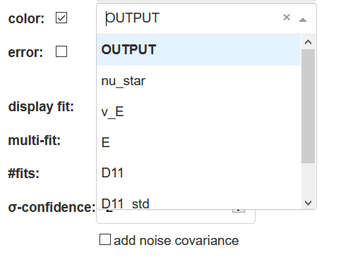
all input-variables
- output
- Type:
dropdown
- Options:
all output-variables
- Default:
first output-variable
- log
- activation of log-scale for each variable
- Type:
checkbox
- Default:
deactivated
Fit options
The section fit options contains the configuration for the fit based on the loaded response model. Depending on the graph-type this includes the following:
- display fit
- Type:
checkbox
- Default:
deactivated
- multi-fit
- Type:
dropdown
- Options:
input-variables
- Default:
last input-variable
- Available:
1D | 2D
- #fits
- number of constructed fits along the dimension (variable) specified in
multi-fit- Type:
input
- Default:
1
- Available:
1D | 2D | 3D
Caution: It is possible that in 3D the top and bottom isosurface may only be partly visible. As a workaround increase#fitsby 2.
- σ-confidence
- width of the confidence interval
- Type:
input
- Default:
2
- Available:
1D | 2D
Types of display:1D: area around the fit line2D: two additional surfaces under and above the fit surface
- add noise covariance
- takes uncertainty of underlying data for the response model into account
- Type:
checkbox
- Default:
deactivated
- Available:
1D | 2D
Caution: Not supported for all surrogate models.
- fit-color
- controls the dimension (variable) for the colorscale in 2D
- Type:
radiobutton & checkbox
- Options:
output-variable|multi-fit|marker color- Default:
output & activated
- Available:
2D
1D: same asmulti-fit3D: same asoutput-variable
- fit-opacity
- Type:
slider
- Range:
[0%, 100%]
- Default:
50%
- Available:
1D | 2D | 3D
1D: opacity of area between upper and lower limit2D/3D: opacity of all surfaces
- #points
- number of predictions along the input axis for the fit based on the response model.
- Type:
input
- Default:
50
Depending on the graph-type the fit will be a line (1D), a surface (2D) or an isosurface (3D). The details for the selection of the fit parameters can be found below in the section response model/fit.
Graph
This section contains the actual graph. Since the graph is generated out of the plotly-library all the plotly tools are available in the upper right corner. This tools include a png-download, zoom, pan, box and lasso select, zoom in/out, autoscale, reset axis and various hover/selection tools.

Graph tools provided by plotly.
The different specific properties of the graph-types are described below. In all graph-types the axis are titled according to the selected variable.
1D
The 1D graph offers a range-slider beneath the plot. With the range-slider the displayed range of data can be defined and moved around along the axis. The alternative to the range-slider is to click&drag in the graph to select a certain area. By using this method, however the viewed area can only be decreased.
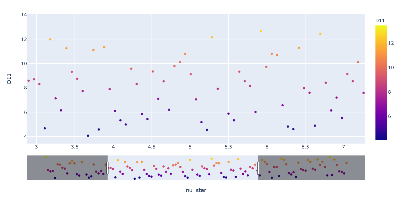
Range-slider on the bottom of the 1D graph.
2D/3D
The 2D and 3D graph can be rotated and tilted by click&drag. The camera position resets as soon as an option is changed.
2D contour
In the 2D contour plot a fit surface of the 2D graph is shown from above. In addition all points in this area are displayed. Because all points (even the points with non-axis parameters far off the fit parameters) are displayed it is recommended to limit the span of the non-axis parameters via the filter-table.
Filter options
The main function of the filter options is to limit the range of the input-variables for the display in the plot and to determine the parameters for the prediction of the fit based on the response model.
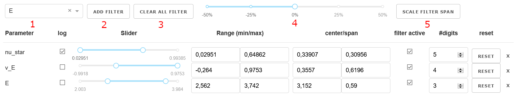
The filter-table with the control elements (numbers according to list).
The filter options are designed as a table. The controls for the entries are located at the table head and consists of the following:
variable-dropdown: select the input-variable to interact
add-filter-button: add selected dropdown-option to table
clear-all-button: remove all filters from table
scale-factor-slider: select a scaling factor
scale-filter-span-button: apply scaling factor to al filter spans
If an variable is added to the filter table a new row appears. The table consists of the following columns:
Parameter: name of the variable (dimension)
log: checkbox to activate log-scale for the whole row (default: deactivated)
Slider: slider to limit the range
Range (min/max): input-fields for the limit of the range.
center/span: input-fields for the center and the span of the range.
filter active: checkbox to activate/deactivate the filter. (default: activated)
#digits: input-field for the number of digits
reset: button to reset the range to the default values (minimum to maximum).
x-button to remove filter-row
Changes to the the values in the different columns will automatically trigger a recalculation of the other values. If the log-checkbox is activated the axis is mapped to a log-scale.
In addition the center values determine the value of the parameter used for the prediction of the fit as described in response model/fit.
Response model/fit
In order to predict the fit the response model needs to be evaluated at different points in the multidimensional parameter space.
Therefore a multidimensional meshgrid is generated. Along the dimensions of the plot (axis-variables) the
meshgrid has the same length as #points.
The points are either linear-spaced or log-spaced based on the activation status of log in the
axis options-section beside the according dimension.
In case of a single fit (#fits = 1) all non-axis parameters for the response model are constant.
The center of the range of this dimension is used. If the range is limited via the filter-table the fit
adjusts accordingly.
In case of a multi-fit (#fits > 1) along the multi-fit dimension the minimum and
maximum of the range will be used as limits for the generation of the vector. The number of points
is chosen according to #fits. Restrictions of the limits via the filter-table will be taken into
account. Based on the activation-status of the log-checkbox in the filter-table a linspace or
logspace-vector will be used.
For further details on the generation of the response model itself see the API documentation of the surrogate model.
Technical Background
The User Interface (UI) is based on plotly/dash for Python (see Homepage).
Dash is a declarative and reactive web-based application. Dash is build on top
of the following components:
Flask
React.js
Plotly.js
The entire UI is running on a Flask web server. Flask is a WSGI (Web Server Gateway
Interface) web app framework. When starting the Dash application a local webserver is
started via Flask. It is possible to extend the application via Flask Plugins.
In Dash one is able to use the entire set of the plotly library. The frontend is
rendered via react.js (react.js on github). react.js is a
declarative, component-based JavaScript library for building user interfaces developed an maintained by Facebook.
When working with Dash there are a lot of standard components available for the user via the
dash_html_components library (see dash_core_components on github) maintained by
the Dash core team. In addition it is possible to write your own component library via the standard open-source
React-to-Dash toolchain.
The second important library especially for structuring the UI is the dash_html_component library
(see dash_html_component on github). It includes a set of HTML tags which are also
rendered via react.js.
For customization it is possible to use CSS stylesheets for the entire interface as well as individual
CSS-styles for each element.
The graphs itself is based on the above mentioned plotly.js library
(see github). This graphic library maintained by Plotly.